Cranbourne Park
Shopping Centre
The underlying principles of the design was to create an active "gateway" façade statement that announced the existing Cranbourne CBD from a council/community perspective and repositioned the shopping centre within the township along with opening up elements of wayfinding and retail along the long façade beside a dual carriage highway.
LOCATION
Boonwurrung Country | Cranbourne, VIC
VALUE
$110M
CLIENT
Federation Centres
YEAR
2012
SECTOR
retail, urban, interiors
STATUS
Complete
PHOTOGRAPHY
Blake Brockdroff, ArchiShot,

Our philosophy was inspired by the existing heritage oak tree on site
The dying oak was nurtured back to a healthy iconic statement within 3 years. The public benefited from a built form organic ribbon statement that denotes the start of the Cranbourne CBD, adds interest and reflection to the façade and creates public space openings that can be activated from within the development.
Our design centred around the leaves, acorns and the organic nature of the ‘ribbon’ along the stark existing façade and an articulated new façade evolved. The design embraced low energy use, low water consumption, high indoor environmental quality, reduced waste and reduced environmental impact.

The building of detailed models incorporating the oak tree elements into the façade directed the language of the ribbons form and we could see the wave of movement over the solid flat wall structures evolving. This allowed the achievement of a major architectural/artistic façade positioned over two existing brutal external walls to breaks up and soften the uses within it. These uses; seating/landscaping pods, openings to carparking zones, entrances, shopfronts, office spaces and openings to outdoor restaurant seating beside the oak tree all become part of a systematic design approach.
Through the design evolution, the existing on-grade carpark that was the focal point to the entrance into Cranbourne CBD was encapsulated and reworked into an undercroft carpark, allowing the built form and organic “ribbon” element to be the showpiece along the highway façade.


Apart from being a genuinely exciting process, taking a step back to review the design and hold it up against the original philosophy and vision has proved invaluable to the redevelopment of Cranbourne Park.

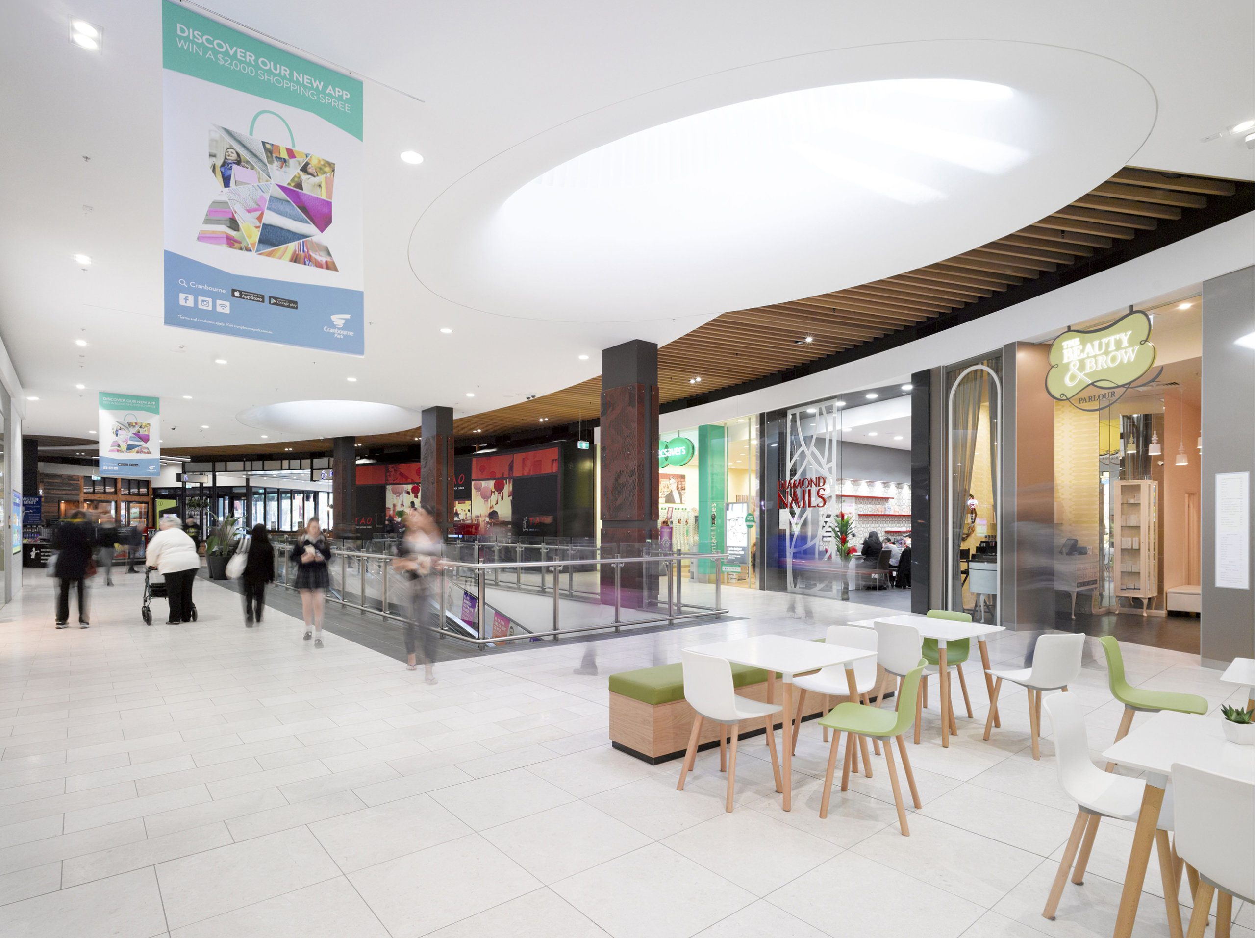
The brief was very complex with new multi-level development, existing redevelopment and repositioning of the centre while trading continued. This site was very lineal and the degree of challenge enhanced by the levels and existing infrastructure that was to be retained. By bringing the external façade elements into the mall and amenities we upgrade the entire centre to achieve a seamless transition between old and new and reposition the centre within the existing hierarchy as the premier centre of the area, in principle, fully leased on opening.

