
The Italian Fresh Mercato
Brand Identity
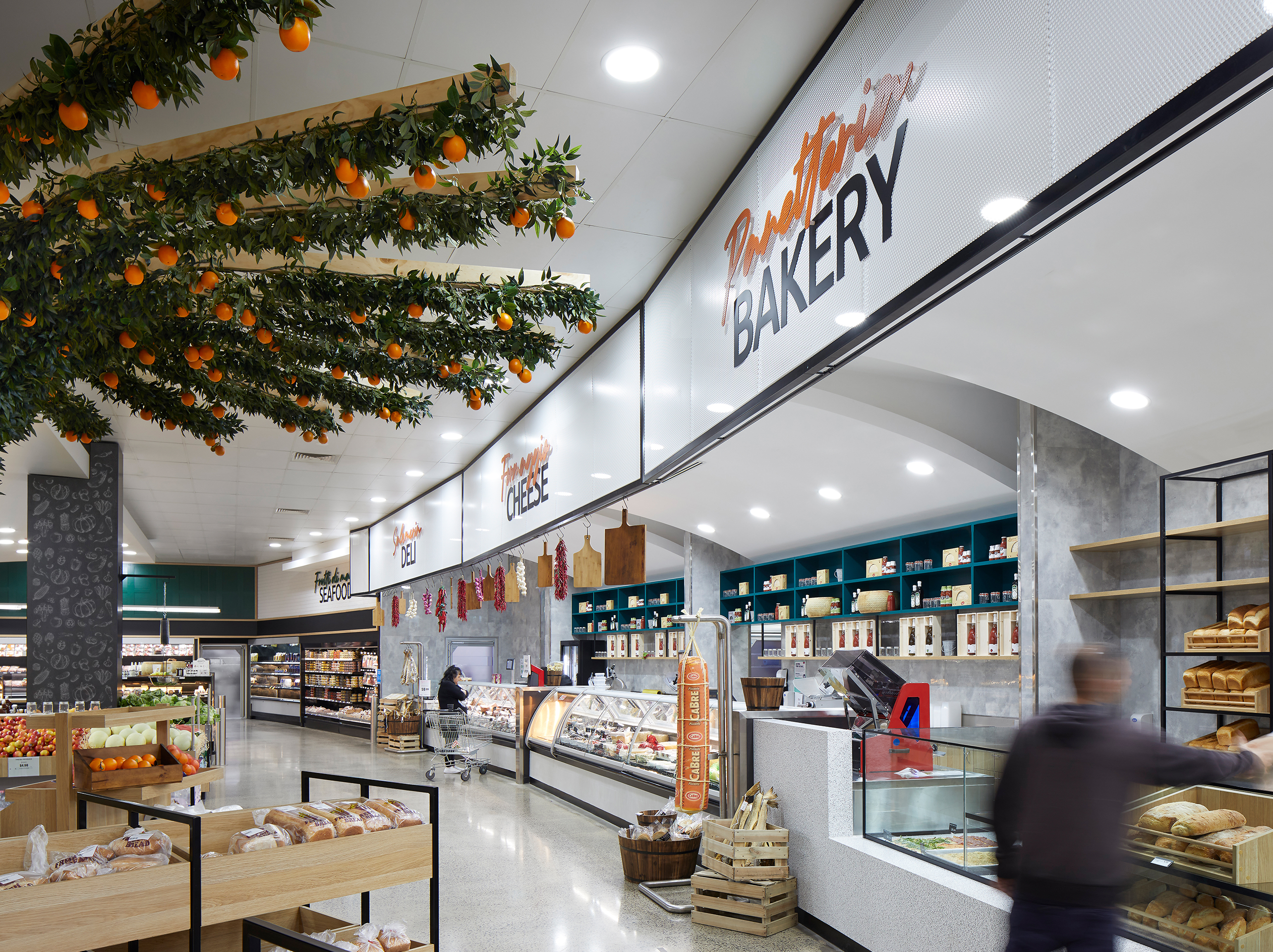
The Italian Fresh Mercato is a 2500m² full range supermarket with the warmth and bespoke touches of a local Italian delicatessen, with brand identity, signage and wayfinding by the i2C Branded Environments team.
LOCATION
Wiradjuri Country | Griffith, NSW
CLIENT
F&L Violi
YEAR
2020
STATUS
Complete
BUILDER
Unita
PHOTOGRAPHY
Ryan Linnegar
Located in Griffith, NSW, The Italian Fresh Mercato leverages the incredible produce of the Griffith region, along with an extensive product list of curated, imported Italian products.
Working closely with the i2C Interior Design team, the brand identity and experience was developed to embody the design idea “A taste of home”. With a target audience of predominately migrant Italian, second-generation Italian-Australians and multi-generation Australians, the key design idea leverages the region’s fame for superb produce and the foundational idea of Italian’s being very food proud.
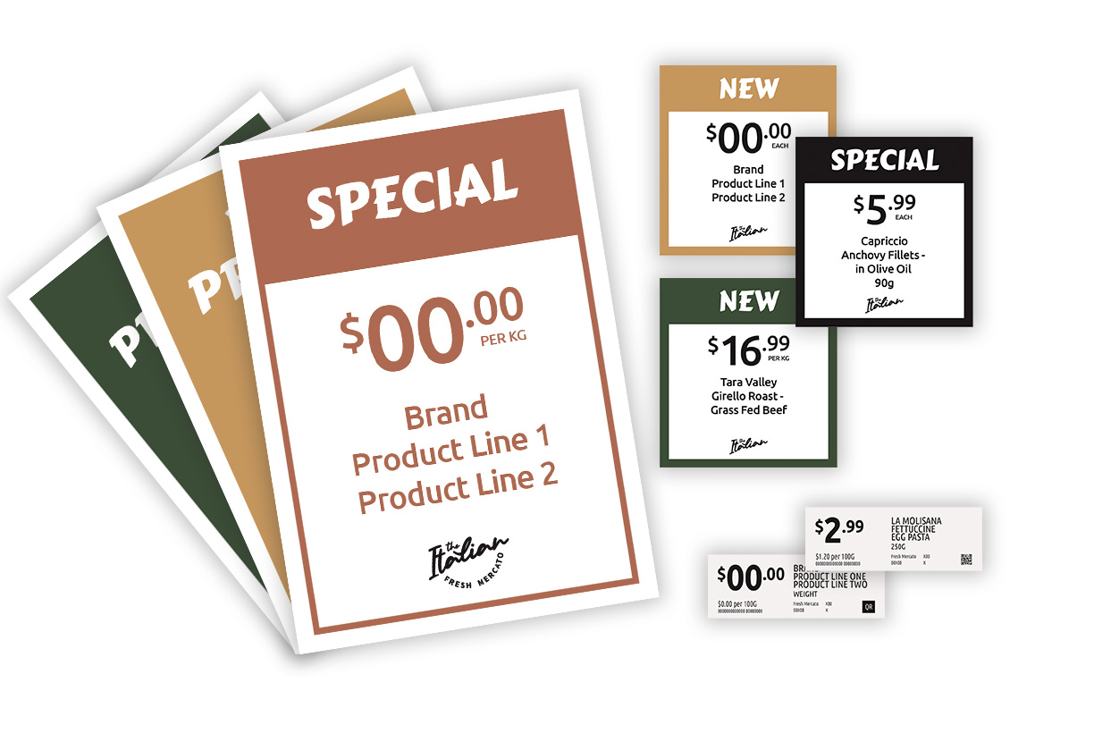
Language and photography play an important role in The Italian Fresh Mercato’s branding and connect with the community through place-based thinking and research. The use of both the Italian and English language in the design of the 10 major bulkhead signage elements allows for a direct representation of the local community and the coming together of cultures. This combining of language also provides opportunities for learning and the joyful experience of shared culture and connection, much like the passing down of food knowledge.


The logo itself is constructed through script-style handwritten typography, reminiscent of the passion, flow and musicality of the Italian language, anchored with the more stamp-like quality of the secondary san serif typographic element. The approach to the logo construction allows for “The Italian” to become the primary descriptor, with the secondary text becoming the identifier, leading to a flexible, versatile and tidy logo for use now as well as any future brand expansion.


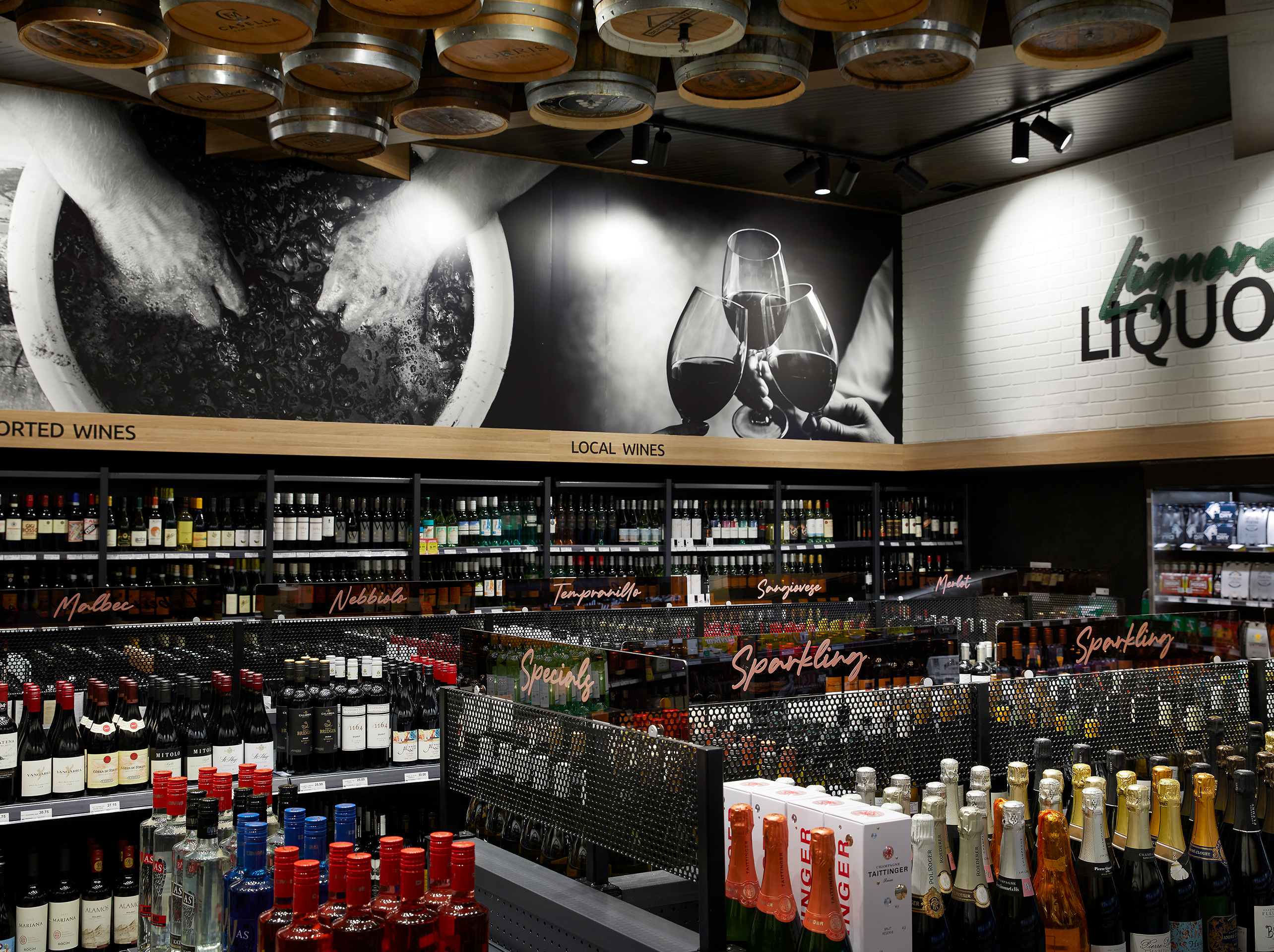
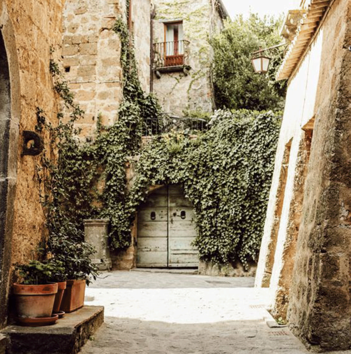
Taking a place-based approach, we looked to vintage Italy to build the colour palette and graphic strategy with nostalgic connections and features that honoured the historic, cobblestoned streets and vine covered shops of Italy. The graphics used throughout the Mercato tell stories of produce and a passion for food and wine, while drawing on similarities between the wine and produce regions of Tuscany and Griffith. The pairing of modern regional Australia references, such as the iconic orange tree something the Griffith region is known for, with reference to regional Italy allows us to create a truly place-based experience.
Overall, we achieved what we set out to do by creating moments for the community to engage with the store and feel a welcoming comfort, just like a hug from Nonna.

