The Italian
Fresh Mercato
i2C’s Interiors Studio was approached by the owner of Griffith Central to create a concept for a bespoke supermarket in their centre. The existing 2500m² IGA had vacated the tenancy and left behind a blank canvas to work from.
LOCATION
Wiradjuri Country | Griffith, NSW
VALUE
$2m
CLIENT
F&L Violi
YEAR
2020
STATUS
Complete
BUILDER
Unita
PHOTOGRAPHY
Ryan Linnegar
With a Coles and Woolworths already located across the street, an opportunity emerged for something unique and exciting to resonate with the locals


i2C were responsible for establishing the full concept from store planning to design aesthetic, as well as logo design and a full branding package.
With the demographic of Griffith being of predominately Italian heritage, the vision for the new supermarket was to provide an authentically Italian experience which embraced the local culture of the community. In collaboration with the client and our Branded Environments team, The Italian Fresh Mercato was established. The speciality offer would focus on fresh produce of the Griffith region, along with an extensive range of imported Italian products, so the concept was curated around nostalgia and the narrative of ‘a taste of home.’
The collective team at i2C took a collaborative, place-based approach, selecting colour palettes and design features that honoured the historic, cobblestoned streets and vine covered shops of Italy, and paired them with references to modern regional Australia, such as the iconic orange tree, something the Griffith region is known for. Collaboration between everyone involved on the project was absolutely critical to ensure the timeline was met. The Interiors team worked closely with the builder to detail every bespoke element from the vine covered arched shopfront, to the specialty bakery cart display, to the rolling pin ceiling over the café.


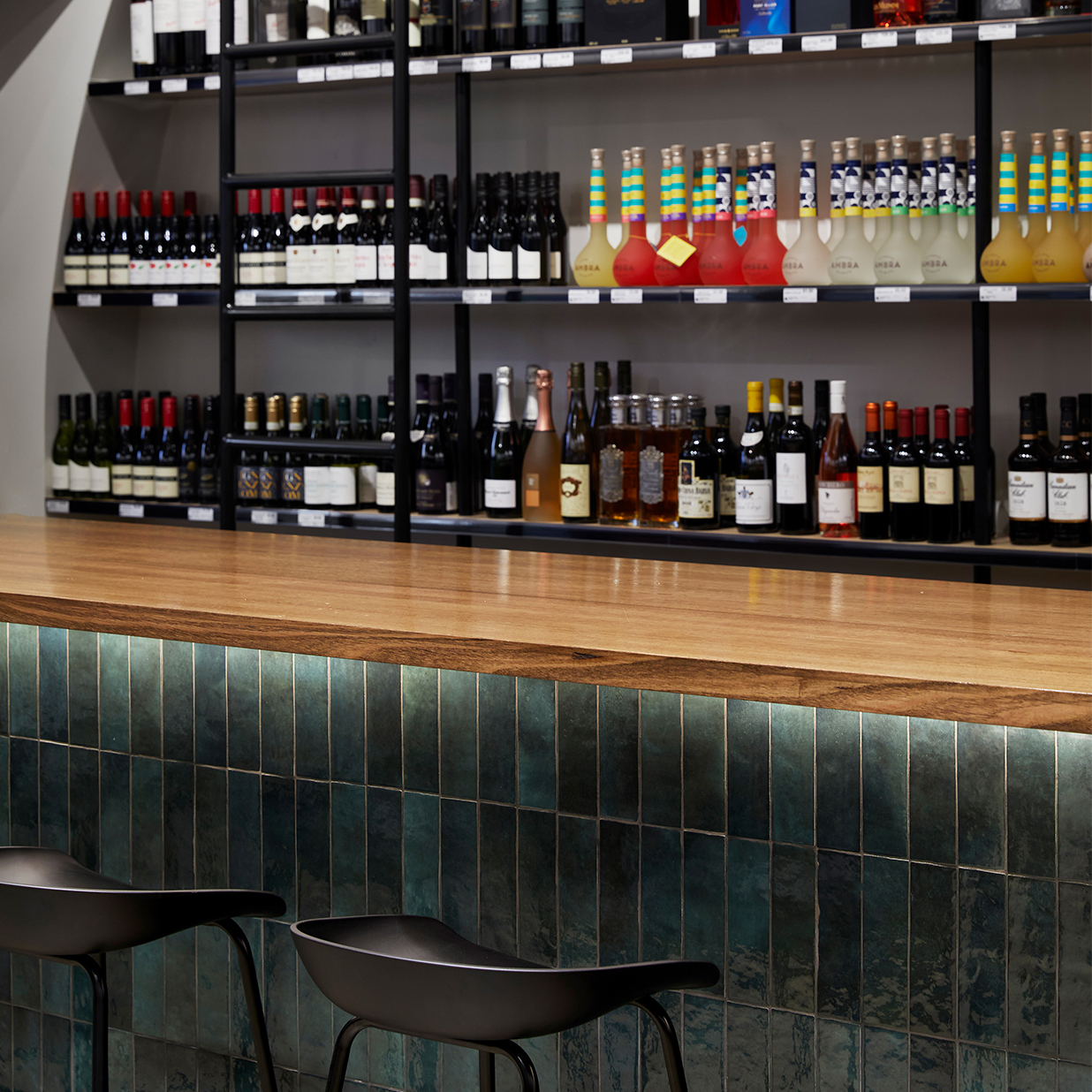
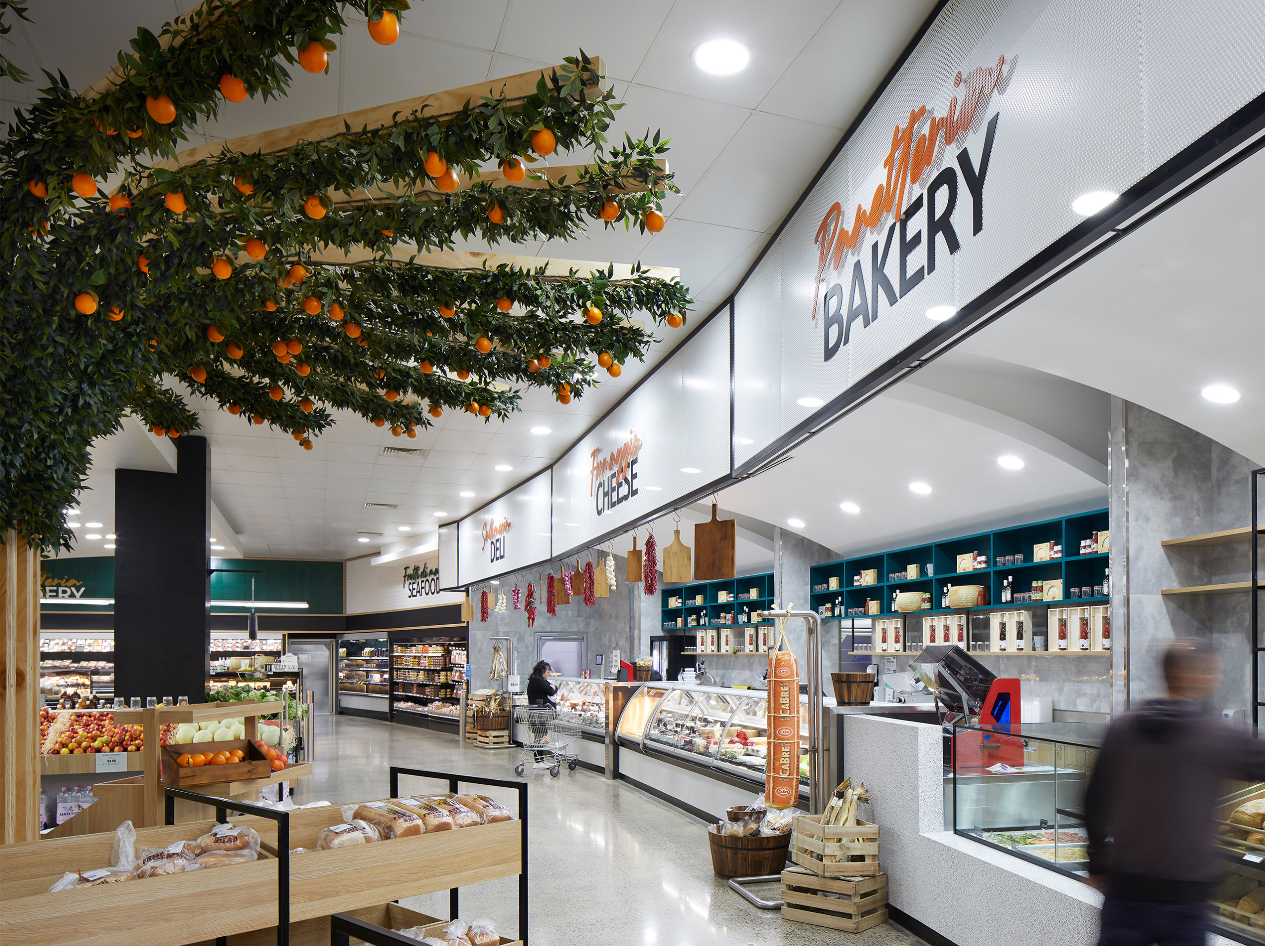
Custom designed details included a wine barrel ceiling in the liquor shop, an arched trellis enclosing the ‘Gourmet Italian’ aisle and a 6.5m wide orange tree feature creating a canopy over the fresh produce area


Using both Italian and English language in the design of the major bulkhead signage allows for a direct representation of the local community and the coming together of cultures.
Choosing to lead with the English language in contrasting tones allows for the purpose of the signage to ring clear with legibility, while the overlayed Italian language adds playful movement and works in harmony with the main wayfinding signage. This combining of languages also provides opportunities for learning and the joyful experience of shared cultures.
Taking a place-based approach, we looked to vintage Italy to build the colour palette and graphic strategy with nostalgic connection and features that honoured the historic, cobblestoned streets and vine-covered shops of Italy. This was then paired with references to modern regional Australia, such as the iconic orange tree something the Griffith region is known for, to create a truly place-based experience.


RELATED PROJECTS

Westpoint Fresh Food
Dharug Country | Blacktown, NSW

Westpoint Amenities
Dharug Country | Blacktown, NSW


