What Can Retail Architecture Learn From Performance Art?

It’s 1988. A fashion show is going down at your local shopping centre food court, the strobe lights are flashing wildly, the area has been washed in a hot pink colour light and someone has set up a smoke machine. A teenage pop singing sensation is about to enter stage left and her 10-year old fans are going crazy. It’s a sight to behold – a brief glimpse of what the future of retail has in store for us.
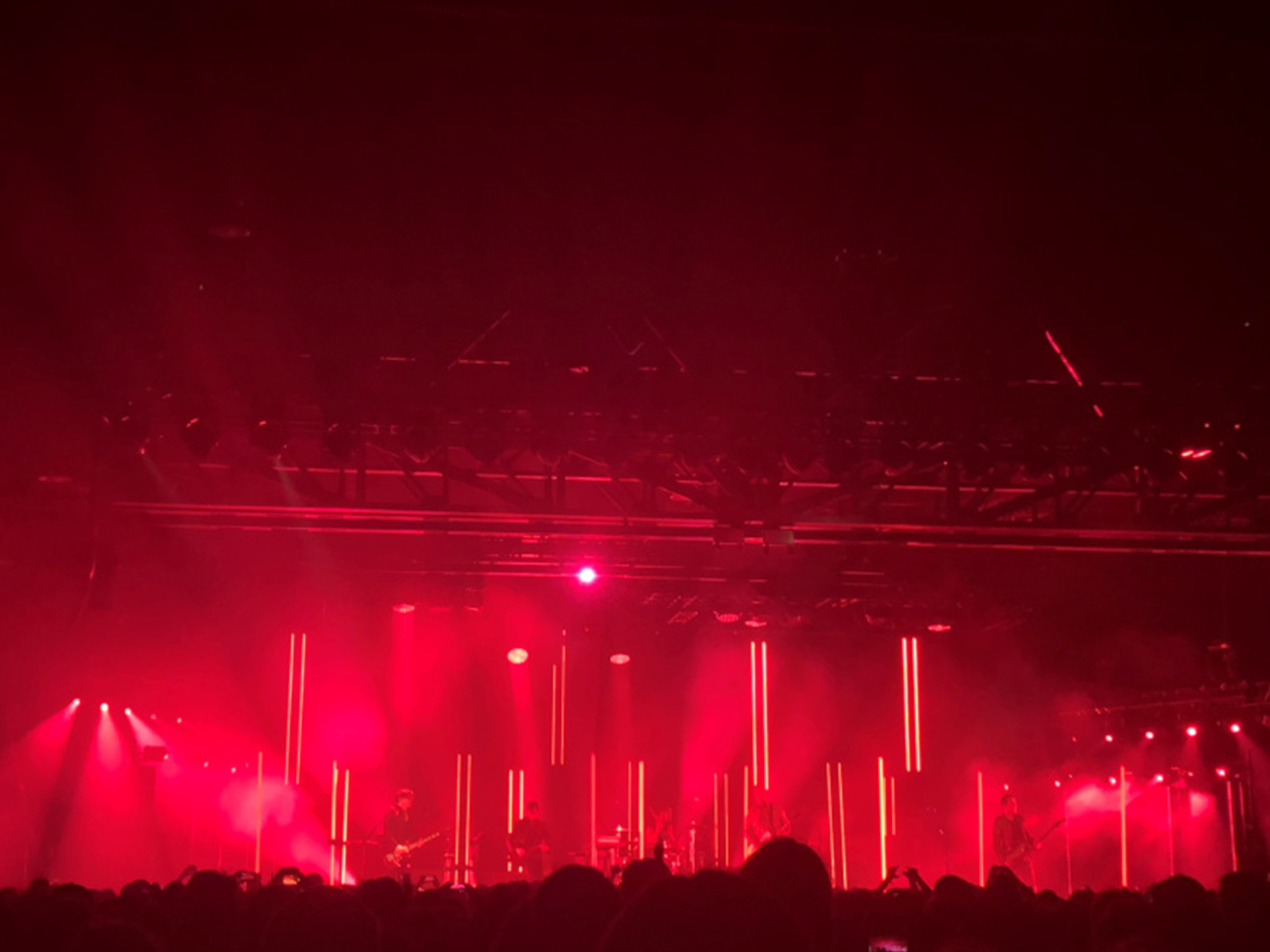
Flash forward thirty years to a concert in Sydney – a band on an otherwise empty stage, the scenes set purely by light and colour without which it would probably feel like we were watching a gig practice in someone’s mum’s garage. The place making qualities of the event are not physical, the band isn’t enclosed by a surface or envelope, yet the audible has become visible and the magic of the performance has been created only through immateriality, hues and tone.
This, and the nostalgic fun described above may seem a million miles and years apart, but they’re more connected than we care to consider.
Before we continue, allow me to introduce you to a boldy bespectacled chap called Richard Kelly, who in 1935 clicked that architecture and placemaking was about a little more than bricks and mortar, but rather an appeal to all the senses to create the awareness and appreciation of place that as designers we’re constantly trying to reinvent.
Kelly was the world’s first lighting designer and is single-handedly responsible for highlighting some of the 20th century’s greatest architectural wonders, giving life and sculptural quality to some of the most iconic built forms of the last 100 years. Kelly is the unsung hero of Modernism. He designed the lighting for Johnson’s Glass House, Kahn’s Kimbell Art Museum, and Mies’s Seagram Building amongst a myriad of others, and showed us how architecture could be experienced both internally and externally, at both day and night. Kelly laid down principals that have been adopted the world over, and has heavily influenced lighting, landscape, facade, interior and set designers of today.
Kelly understood that to create a space that is interesting and successful, one should appeal to the subconscious of the user and speak to the experience intended. The space should have qualities of visual delight, volumes and proportions that address our human scale, and a form that creates comfort and awareness of context. As architects we busy ourselves with designing buildings and interiors that tick these boxes but can we pick up cues from artists and installations, to further our retail architecture discourse? I think we can.


Gigi Pedron is a musical lighting director who tours with big name acts, working behind the scenes to produce sets using nothing but lights that tell the stories a band is singing. She colours the music she hears, making an art that is tangible but not permanent and is always spontaneous, always changing. Her installation creates her environment and the hues provide atmosphere, spotlights allow for focal points against washes of colour, in turn creating movement, rhythm, mood and form. She is an artist by trade, but a place maker at heart. She’s an architect who doesn’t know it.


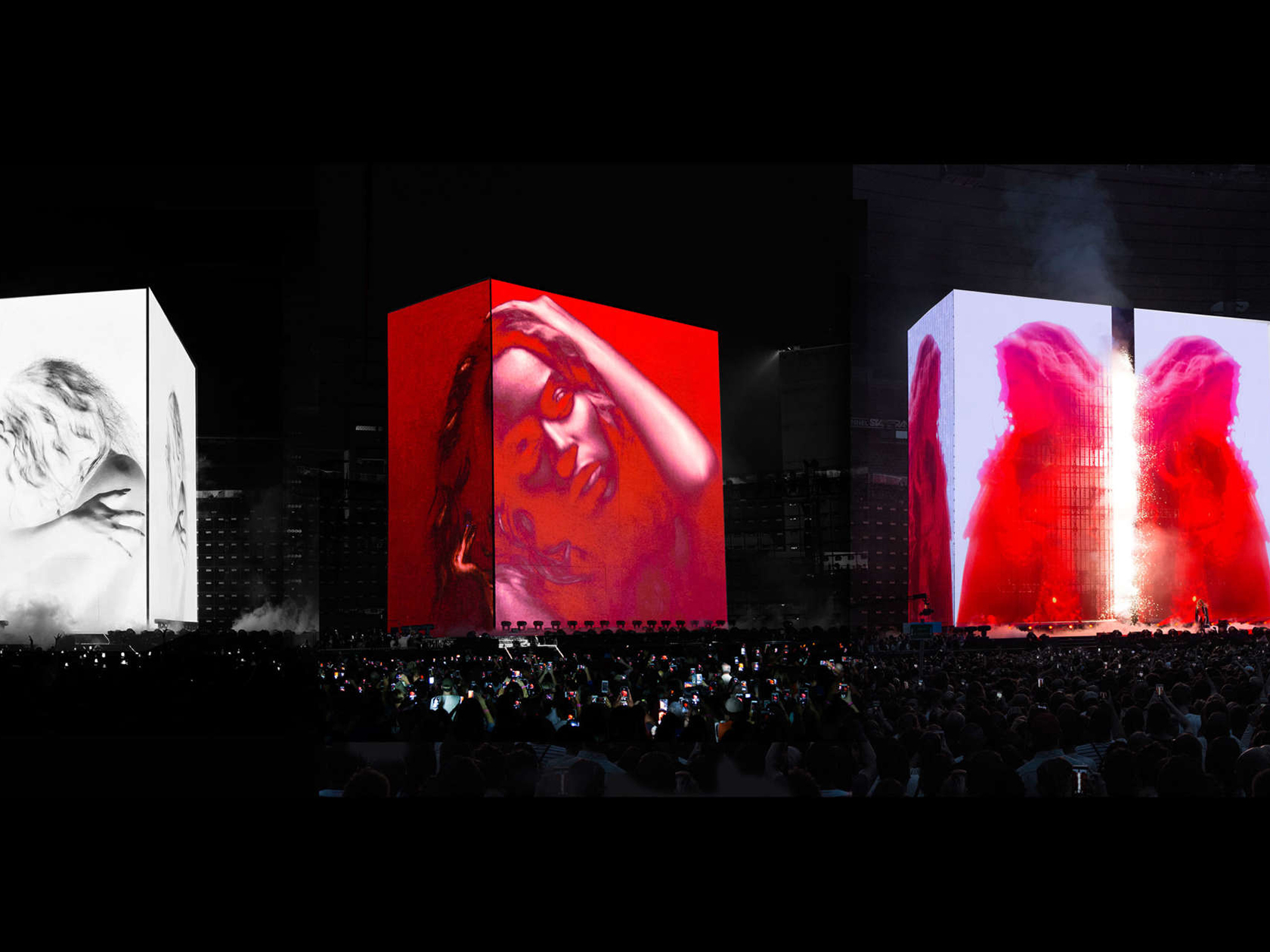
Es Devlin, on the other hand, is a performance-based artist who has been shaping the way we view live music for years with set design using sculptural mass and light. She creates an environment aimed at user experience, and through volume and proportion can take just about anyone’s breath away. She is a visual artist first and foremost, but an architect nonetheless. This has been further emphasised by her appointment to design the UK Pavilion at Expo 2020. By using sculpture, light and programming she hopes to bring poetic awareness to the user and a unique experience encompassing built form.


Devlin and Pedron have built fabulous, successful and artsy careers based on principles identified by Kelly, and we can learn substantially as designers from them. All the characters in this story have an awareness of space in way more than 3D; they understand the value of appealing to the senses to build the experience for the user, and that this doesn’t necessarily need to be through fancy finishes. They look not only at texture but at visual delight. They use colour and light played off architecture at a scale relative to the user to create scenes of wonder and awe. They build theatrical, dramatic experiences through more than solids and voids.
Whether it’s a strobe and colour wash in an eighties food court, a modern day outdoor dining precinct or a Beyoncé concert, these environments are well-considered productions and we have an as important role to play. We should always ensure our architecture aspires to generate as much fascination and appeal through all forms of materiality and immateriality, lighting very much included. The theatre of retail architecture has never been more relevant, and it is our task to set these stages for the user, to create the best experience possible. A true inspiration to completion mission.
